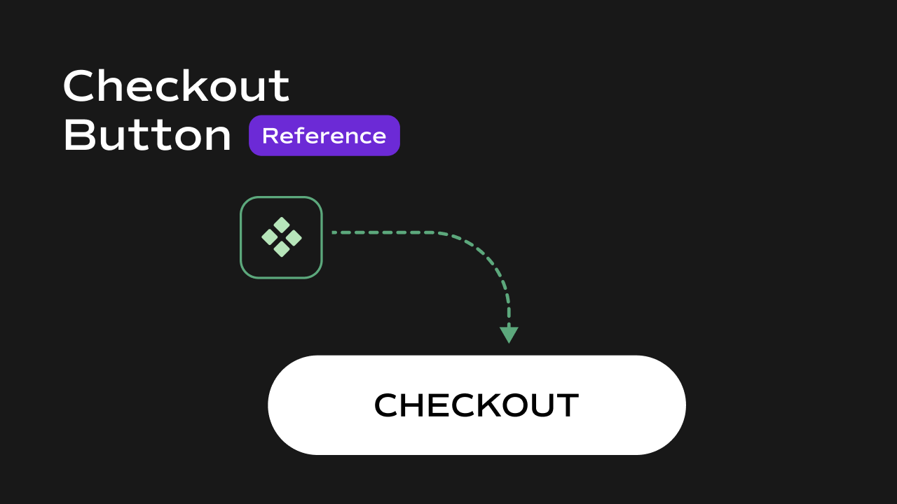
Checkout Button
 What it does
Triggers Shopify checkout using a fully custom Framer button or element.
Controls
What it does
Triggers Shopify checkout using a fully custom Framer button or element.
Controls
| Control | Description |
|---|---|
| Children | Custom button or element that triggers checkout |
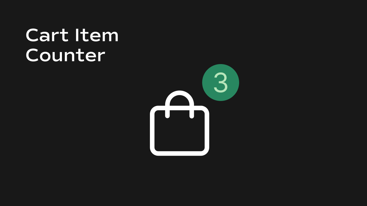
Cart Counter
 What it does
Displays a live-updating count of items in the cart.
Controls
What it does
Displays a live-updating count of items in the cart.
Controls
| Control | Description |
|---|---|
| Font | Typography used for cart count |
| Color | Color of cart count text |
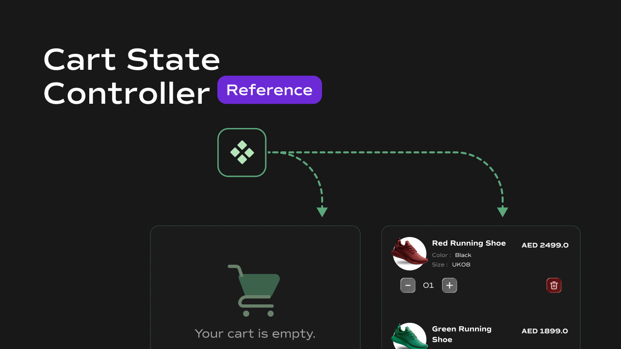
Cart State
 What it does
Switches between empty and filled cart UI automatically.
Controls
What it does
Switches between empty and filled cart UI automatically.
Controls
| Control | Description |
|---|---|
| Filled | Content shown when cart has items |
| Empty | Content shown when cart is empty |
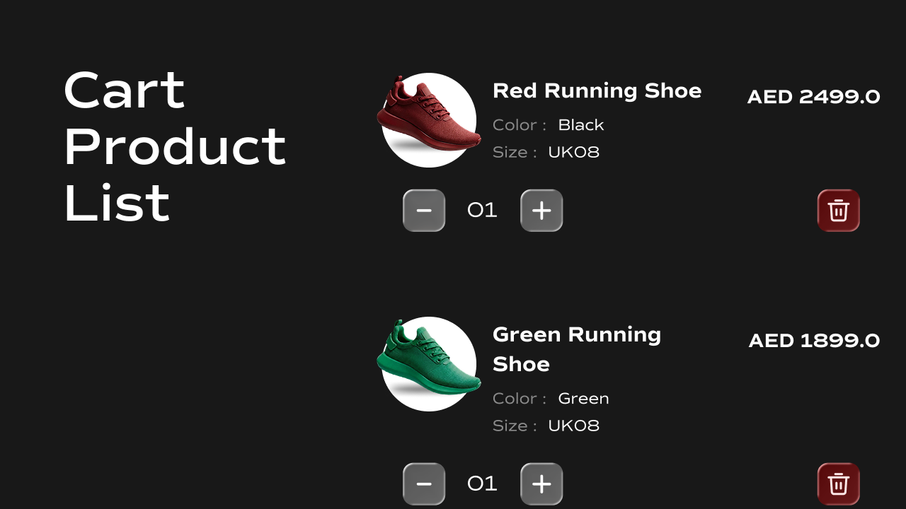
Cart Items
 What it does
Displays a full list of cart items with quantity controls, remove actions, and extensive styling options.
Controls
What it does
Displays a full list of cart items with quantity controls, remove actions, and extensive styling options.
Controls
| Control | Description |
|---|---|
| Quantity Styles | Style quantity selector |
| Trash Icon Styles | Style remove item button |
| Title Styles | Product title styling |
| Price Styles | Product price styling |
| Variant Styles | Variant label & value styling |
| Card Styles | Layout and styling of item cards |
| Image Styles | Product image size and radius |
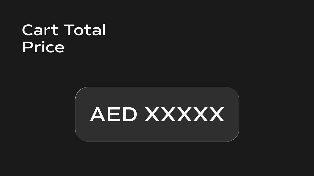
Cart Total
 What it does
Displays the real-time cart total before shipping and taxes.
Controls
What it does
Displays the real-time cart total before shipping and taxes.
Controls
| Control | Description |
|---|---|
| Font | Typography for cart total |
| Color | Text color of total price |
| Auto Update | Updates when cart changes |
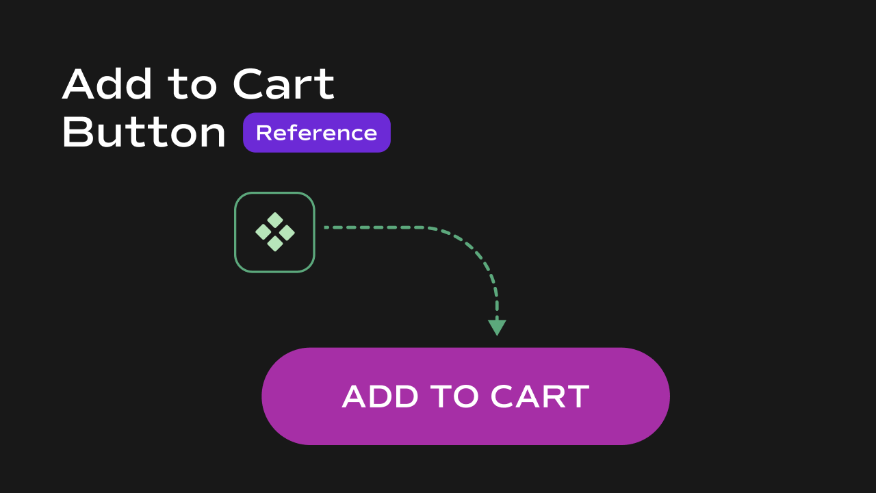
Add to Cart Button
 What it does
Adds the selected product variant to the cart from any page with a single click and shows a confirmation toast.
Controls
What it does
Adds the selected product variant to the cart from any page with a single click and shows a confirmation toast.
Controls
| Control | Description |
|---|---|
| Store ID | Pass store ID from CMS |
| Product ID | Pass product ID from CMS |
| Product Title | Used in cart and notifications |
| Variants | Pass CMS variant data |
| Image URLs | Pass CMS product images |
| Button Text | Default button label |
| Loading Text | Text shown while adding |
| Styles | Button visual styling |
| Toast Position | Position of confirmation toast |