Variant Picker
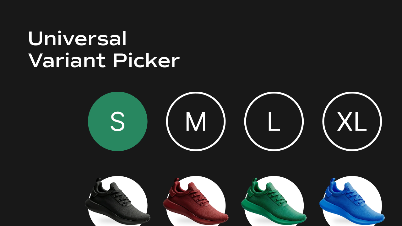 What it does
Allows users to select product variants (Size, Style, Material, etc.) using CMS-passed variant data.
Controls
What it does
Allows users to select product variants (Size, Style, Material, etc.) using CMS-passed variant data.
Controls
| Control | Description |
|---|---|
| Variants | Pass CMS variant data using a Framer variable |
| Option | Variant option name (e.g. Size, Style) |
| Layout | Arrange options horizontally or vertically |
| Gap | Space between variant options |
| Label Direction | Layout direction for label and options |
| Label Gap | Space between label and options |
| Container Styles | Selected / unselected colors, disabled state styling, padding, border, radius, shadow |
| Label Styles | Font, color, and typography for the label |
| Show Label | Toggle label visibility |
Color Variant Picker
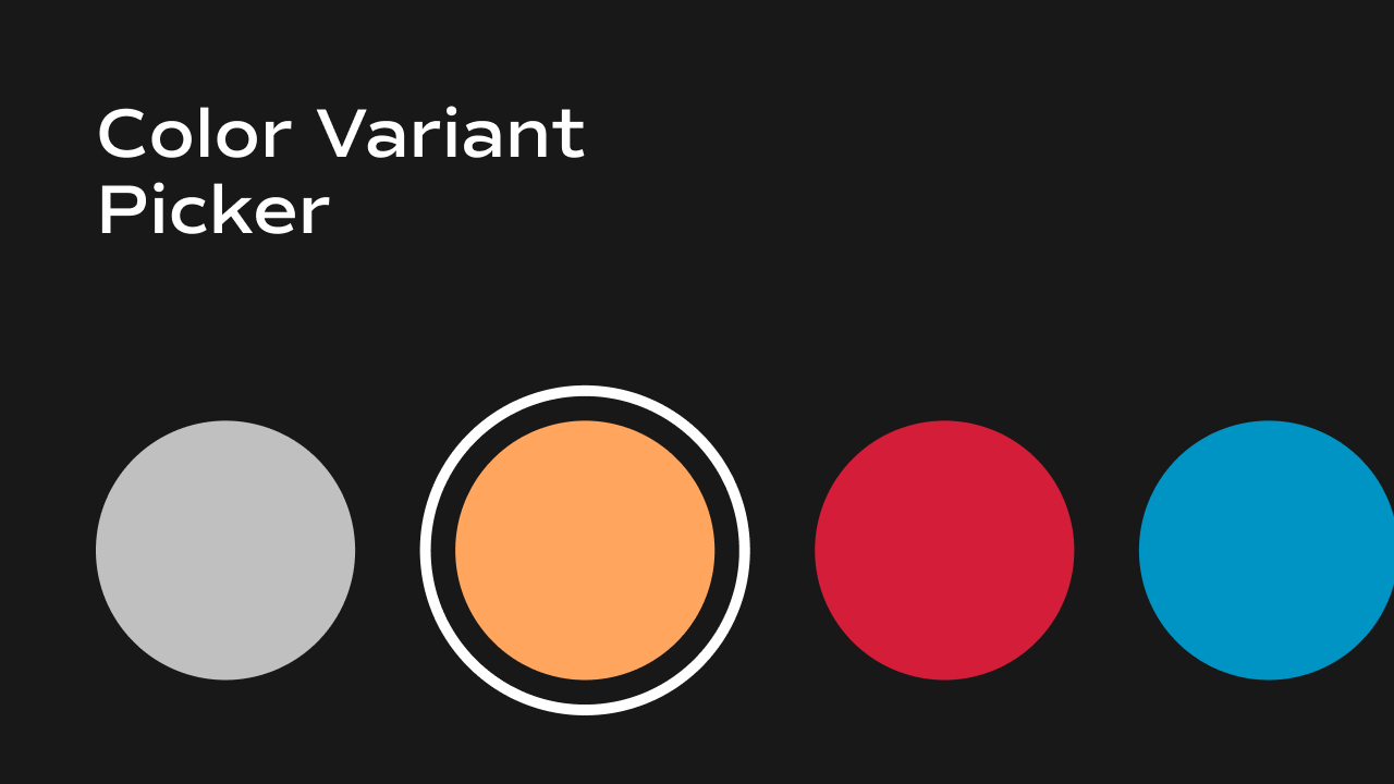 What it does
Displays color-based variants as visual swatches and syncs selection with product variants.
Controls
What it does
Displays color-based variants as visual swatches and syncs selection with product variants.
Controls
| Control | Description |
|---|---|
| Variants | Pass CMS color variant data |
| Swatch Size | Size of color swatches |
| Selected Border | Highlight selected color |
| Disabled State | Style unavailable colors |
Filter by Variant
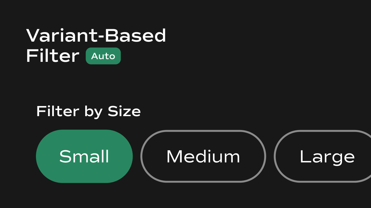 What it does
Filters CMS product listings based on selected variant values and shares filtered product IDs with other components.
Controls
What it does
Filters CMS product listings based on selected variant values and shares filtered product IDs with other components.
Controls
| Control | Description |
|---|---|
| Variants | Read selected variant values |
| Storage Key | Uses localStorage to share filtered IDs |
| Auto Update | Updates product list instantly |