 A fully interactive cart item list component for Framer that reads from
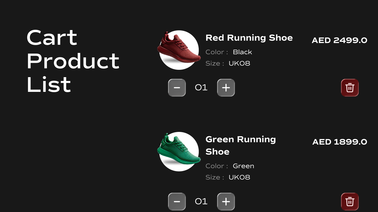
 localStorage, renders each item with its image, title, variant options, price, and quantity controls, and supports increasing, decreasing, and removing items in real time.
What It Does
The Cart Product List renders all items currently in the cart as individual cards. Each card shows the product image, title, selected variant options, price, a quantity stepper (+/−), and a trash icon to remove the item. All interactions write directly back tolocalStorage and dispatch a cartUpdated event to keep other cart components in sync.
Key behaviors at a glance:
- **Reads cart from **
localStorage— on mount, reads thecartkey and renders one card per item. - Increase / decrease quantity — the
+and−buttons update the item’s quantity. The minimum quantity is1; the−button does not go below it. - Remove item — the trash icon removes the item from the cart entirely.
- **Writes back to **
localStorage— every quantity or delete action saves the updated cart back tolocalStorageand dispatches acartUpdatedevent so the Cart Item Counter, Cart State Controller, and any other cart components update instantly. - Preview-safe dummy data — when the cart is empty (e.g. on the Framer canvas), the component renders five sample items so the layout is always visible while designing.
- Updates in real time — listens for
cartUpdatedevents from other components so the list stays in sync if the cart is modified elsewhere on the page.
Property Controls
All controls are accessible in Framer’s right panel when the component is selected. They are grouped into four sections: Outer Container, Card, Image, and Content.Outer Container
| Property | Type | Description |
|---|---|---|
| Gap between cards | Number (px) | Vertical spacing between individual cart item cards. |
Card
Controls the appearance of each cart item card.| Property | Type | Default | Description |
|---|---|---|---|
| Padding | Padding | — | Inner spacing inside each card. |
| Border | Border | 1px solid rgba(0,0,0,0.5) | Border style of each card. |
| Border Radius | BorderRadius | — | Corner rounding of each card. |
| Shadow | BoxShadow | 0px 1px 2px 0px rgba(0,0,0,0.25) | Shadow applied to each card. |
| Background | Color | #fff | Background color of each card. |
| Gap | Number (px) | — | Horizontal spacing between the product image and the content area. |
Image
Controls the product image on the left side of each card.| Property | Type | Default | Description |
|---|---|---|---|
| Width | Number (px) | 180 | Width of the product image. |
| Height | Number (px) | 180 | Height of the product image. |
| Border Radius | BorderRadius | — | Corner rounding of the product image. |
| Type | Enum | Contain | How the image fills its box. Options: Contain, Cover, Fill. |
Content
Controls all text, layout, and interactive elements in the right-hand content area of each card.Quantity
Controls the quantity stepper (− / value / +). Container — the pill or box wrapping all three elements:| Property | Type | Default | Description |
|---|---|---|---|
| Gap | Number (px) | 4 | Spacing between the buttons and the quantity value. |
| Background | Color | #000 | Background color of the quantity container. |
| Padding | Padding | — | Inner spacing of the quantity container. |
| Border | Border | 1px solid rgba(0,0,0,0.5) | Border of the quantity container. |
| Border Radius | BorderRadius | — | Corner rounding of the quantity container. |
| Shadow | BoxShadow | 0px 1px 2px 0px rgba(0,0,0,0.25) | Shadow on the quantity container. |
+ and − buttons:
| Property | Type | Default | Description |
|---|---|---|---|
| Padding | Padding | — | Inner spacing of each button. |
| Border | Border | 1px solid rgba(0,0,0,0.5) | Border of each button. |
| Border Radius | BorderRadius | — | Corner rounding of each button. |
| Background | Color | #fff | Background color of each button. |
| Icon Color | Color | #000 | Color of the plus and minus icons. |
| Icon Size | Number (px) | 16 | Size of the plus and minus icons. |
| Property | Type | Default | Description |
|---|---|---|---|
| Font | Font | — | Typography for the quantity number. |
| Color | Color | #fff | Text color of the quantity number. |
Trash Icon
Controls the remove item button.| Property | Type | Default | Description |
|---|---|---|---|
| Background | Color | #000 | Background color of the trash icon container. |
| Color | Color | #fff | Color of the trash icon. |
| Size | Number (px) | 16 | Size of the trash icon. |
| Padding | Padding | — | Inner spacing around the trash icon. |
| Border Radius | BorderRadius | — | Corner rounding of the trash icon container. |
Title
| Property | Type | Default | Description |
|---|---|---|---|
| Font | Font | — | Typography for the product title. |
| Color | Color | #000 | Text color of the product title. |
Price
| Property | Type | Default | Description |
|---|---|---|---|
| Font | Font | — | Typography for the product price. |
| Color | Color | #000 | Text color of the product price. |
| Alignment | Enum | Center | Vertical alignment of the price relative to the title. Options: Center, Flex Start, Flex End. |
Variant
Controls the variant option labels (e.g.Color: Black) shown under the product title.
Key — the option name (e.g. Color, Size):
| Property | Type | Default | Description |
|---|---|---|---|
| Font | Font | — | Typography for variant key labels. |
| Color | Color | #000 | Text color of variant key labels. |
Black, Large):
| Property | Type | Default | Description |
|---|---|---|---|
| Font | Font | — | Typography for variant values. |
| Color | Color | #000 | Text color of variant values. |
Spacing
| Property | Type | Description |
|---|---|---|
| Padding | Padding | Inner spacing of the entire content area. |
| Gap | Gap | Spacing between title, variant labels, and price. |
| Main Gap | Gap | Spacing between the upper content block (title, variants, price) and the lower controls (quantity stepper and trash icon). |
Notes
- Each cart item in
localStoragemust includevariantId,title,price.amount,quantity,selectedOptions, and optionallyimage. Ifimageis missing, a placeholder image is shown. - Every interaction (increase, decrease, delete) dispatches a
cartUpdatedevent onwindowafter saving tolocalStorage, keeping the Cart Item Counter and Cart State Controller in sync automatically. - The minimum quantity per item is
1. Clicking−on a quantity of1does nothing. - When the cart is empty, five dummy preview items are rendered so the layout remains visible in Framer’s canvas while designing.