 A scrollable product image gallery component for Framer with support for zoom, sticky floating thumbnails, horizontal/vertical orientation, and variant-based image switching.
What It Does
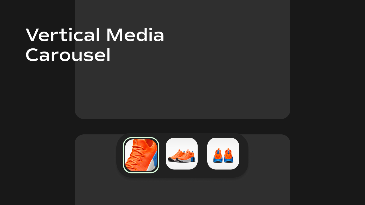
The Vertical Media Carousel displays a list of product images in a scrollable gallery. As the user scrolls through the images, a floating thumbnail bar appears at the bottom of the gallery — letting users quickly jump to any image by clicking its thumbnail. Key behaviors at a glance:- Scrollable image gallery — images stack vertically (or sit side-by-side horizontally) and the user scrolls through them naturally.
- Auto-detecting active image — as the user scrolls, the component watches which image is in view and highlights the matching thumbnail automatically.
- Sticky floating thumbnails — a pill-shaped thumbnail bar floats over the bottom of the gallery while the user is scrolling through it. It fades in when the gallery enters the viewport and fades out when the user scrolls past it.
- Click-to-jump thumbnails — clicking any thumbnail smoothly scrolls the gallery to that image.
- Zoom on hover — hovering over an image zooms into the area under the cursor (can be toggled off).
- Variant-aware — reads a
?variant=URL query parameter and automatically scrolls to the image that matches the selected product variant. - Horizontal mode — optionally lays out images in a horizontal row instead of a vertical column.
Property Controls
All controls are accessible in Framer’s right panel when the component is selected. They are grouped into four sections: Image, Variants, Gallery, and Thumbnail.Image
| Property | Type | Default | Description |
|---|---|---|---|
| Image | String (JSON) | 4 sample Unsplash URLs | A JSON array of image URLs to display in the gallery. In Framer CMS, connect this to the "Image URLs" variable from your CMS collection. |
Variants
| Property | Type | Description |
|---|---|---|
| Variants | String (JSON) | A JSON array of product variant objects, each containing an id and an image.url. Connect this to the Variants variable from your Framer CMS. When a visitor lands on the page with a ?variant=<id> URL parameter, the gallery automatically scrolls to the image matching that variant. |
Gallery
Controls the visual appearance and layout of the main image list.| Property | Type | Default | Description |
|---|---|---|---|
| Aspect Ratio | String | 1/1 | The width-to-height ratio of every image in the gallery. Use CSS ratio syntax: 1/1 (square), 4/5 (portrait), 16/9 (landscape), etc. |
| Orientation | Enum | Vertical | Controls the scroll direction of the gallery. Vertical stacks images top-to-bottom; Horizontal lays them out left-to-right. |
| Gap | Number (px) | 16 | The spacing between images in the gallery. Range: 0–100 px. |
| Border Radius | Number (px) | 8 | Rounds the corners of each image. Range: 0–50 px. |
| Enable Zoom | Boolean | true | When enabled, hovering over an image zooms into the area under the mouse cursor (2× zoom). Disable this for a static gallery experience. |
Thumbnail
Controls the floating thumbnail navigation bar.| Property | Type | Default | Description |
|---|---|---|---|
| Show | Boolean | true | Master toggle. Turn this off to hide the thumbnail bar entirely. |
| Position | Enum | Bottom | Where the thumbnail bar is anchored. Options: Bottom, Left, Top, Right. (Note: the current layout engine positions the bar at the bottom of the visible gallery area regardless of this setting — the value is stored for future directional support.) |
| Thumbnail Bottom Offset | Number (px) | 20 | How far above the bottom edge of the gallery the thumbnail bar floats. Increase this if the thumbnails overlap other page elements. Range: 0–200 px. Hidden when Show is off. |
| Thumbnail Blur | Number (px) | 12 | The intensity of the frosted-glass blur effect on the thumbnail bar’s background. 0 removes the blur. Range: 0–50 px. Hidden when Show is off. |
| Thumbnail Border Radius | Number (px) | 20 | Rounds the corners of the thumbnail bar container. Range: 0–50 px. Hidden when Show is off. |
| Thumbnail Active Color | Color | #3094cd | The border color that highlights the currently active thumbnail (the one matching the image in view). Hidden when Show is off. |
| Thumbnail Size | Number (px) | 40 | The width and height of each thumbnail image. Range: 24–80 px. Hidden when Show is off. |
Notes
- Image URLs must be passed as a JSON array string (e.g.
["https://...", "https://..."]). Framer CMS handles this automatically when you connect the right variable. - The zoom effect is purely CSS transform-based — no library required. It zooms 2× centered on the mouse position.
- The thumbnail bar auto-scrolls horizontally when there are more thumbnails than fit in the visible area.