 A single-image slider gallery component for Framer with thumbnail navigation, arrow controls, zoom on hover, and variant-based image switching.
What It Does
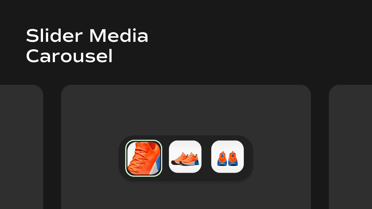
The Slider Media Carousel displays one image at a time and lets users navigate between them using arrow buttons or by clicking thumbnails. Unlike the Vertical Media Carousel, only one image is shown at a time — the rest are accessible through navigation. Key behaviors at a glance:- Single image view — only one image is displayed at a time, with a smooth fade transition when switching.
- Arrow navigation — previous/next arrow buttons let users step through images. Arrows can be repositioned and grouped into a compact layout.
- Thumbnail strip — a row or column of thumbnail images appears alongside the main image. Clicking a thumbnail jumps directly to that image. The strip auto-scrolls to keep the active thumbnail in view.
- Configurable thumbnail position — thumbnails can be placed above, below, to the left, or to the right of the main image.
- Zoom on hover — hovering over the main image zooms into the area under the cursor (can be toggled off).
- Variant-aware — reads a
?variant=URL query parameter and automatically switches to the image that matches the selected product variant.
Property Controls
All controls are accessible in Framer’s right panel when the component is selected. They are grouped into four sections: Image, Variants, Gallery, Thumbnail, and Arrows.Image
| Property | Type | Default | Description |
|---|---|---|---|
| Image | String (JSON) | 3 sample Nike shoe URLs | A JSON array of image URLs to display in the slider. In Framer CMS, connect this to the "Image URLs" variable from your CMS collection. |
Variants
| Property | Type | Description |
|---|---|---|
| Variants | String (JSON) | A JSON array of product variant objects, each containing an id and an image.url. Connect this to the Variants variable from your Framer CMS. When a visitor lands on the page with a ?variant=<id> URL parameter, the slider automatically switches to the image matching that variant. |
Gallery
Controls the appearance of the main image display.| Property | Type | Default | Description |
|---|---|---|---|
| Aspect Ratio | String | 1/1 | The width-to-height ratio of the main image. Use CSS ratio syntax: 1/1 (square), 4/5 (portrait), 16/9 (landscape), etc. |
| Enable Zoom | Boolean | true | When enabled, hovering over the main image zooms into the area under the mouse cursor (2× zoom). Disable for a static experience. |
Thumbnail
Controls the thumbnail strip alongside the main image.| Property | Type | Default | Description |
|---|---|---|---|
| Position | Enum | Bottom | Where the thumbnail strip appears relative to the main image. Options: Bottom, Left, Top, Right. Horizontal positions (Top, Bottom) lay thumbnails in a row; vertical positions (Left, Right) stack them in a column. |
Arrows
Controls the previous/next navigation arrows overlaid on the main image.| Property | Type | Default | Description |
|---|---|---|---|
| Show | Boolean | true | Master toggle. Turn this off to hide both arrows entirely. Only appears when there is more than one image. |
| Position | Enum | Top Left | Where the arrows are placed on the main image. Options: Center, Top Left, Top Right, Bottom Left, Bottom Right. |
| Compact | Boolean | false | When enabled, both arrows are grouped together on the same side of the image rather than sitting on opposite sides. Useful for a cleaner, minimal layout. |
Notes
- Image URLs must be passed as a JSON array string (e.g.
["https://...", "https://..."]). Framer CMS handles this automatically when you connect the right variable. - The zoom effect zooms 2× centered on the mouse position and is purely CSS transform-based.
- The thumbnail strip hides its scrollbar visually but remains scrollable when there are more thumbnails than fit in the available space.
- Arrows are hidden automatically when there is only one image.