 A cart-aware visibility switcher for Framer that renders one of two components depending on whether the cart has items or is empty.
What It Does
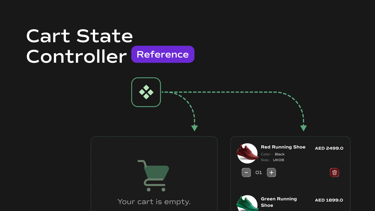
The Cart State Controller conditionally renders one of two child components based on the current cart state. It is designed for use cases like showing a filled cart icon when items are present and an empty cart icon when the cart is cleared — or toggling entire UI sections based on cart state. Key behaviors at a glance:- Switches between two states — renders the Filled slot when the cart has one or more items, and the Empty slot when the cart is empty or not yet loaded.
- **Reads cart from **
localStorage— on mount, reads thecartkey fromlocalStorageto determine the initial state. - Updates in real time — listens for a custom
cartUpdatedevent onwindow. When any other component dispatches this event after modifying the cart, the controller switches its displayed state instantly without a page reload. - Stretches child to fill — automatically sets the first child element’s width and height to
100%so it fills the container regardless of the child component’s own sizing.
Property Controls
| Property | Type | Description |
|---|---|---|
| Filled | Component Instance | The Framer component shown when the cart contains one or more items. |
| Empty | Component Instance | The Framer component shown when the cart is empty. |
Notes
- Both slots accept any Framer component — icon variants, full UI sections, animated elements, etc.
- The switch is based on the number of line items in the cart array, not total quantity. An array with one entry counts as filled even if its quantity is greater than
1. - Any component that modifies the cart must dispatch a
cartUpdatedevent onwindowafter writing tolocalStoragefor the controller to react — otherwise it will only reflect the state from initial page load. - Until
localStorageis read on mount,itemsisnulland the Empty slot is shown by default.