Variant-Based Filter
A Shopify-connected product filter component for Framer that fetches all variant options across your catalog and renders them as clickable filter buttons, storing the active selection inlocalStorage for other components to consume.
What It Does
The Variant-Based Filter fetches every product variant from your Shopify store via the Storefront API, groups them by option name (e.g. Size, Color, Frame Style), and displays each unique value as a filter button. When a user clicks a button, the component stores the selection inlocalStorage and broadcasts a storage event — allowing a product listing component on the same page to reactively filter its results.
Key behaviors at a glance:
- Fetches variants from Shopify — on load, queries the Shopify Storefront API to get all products and their variants. Falls back to dummy preview data if Shopify credentials are not available (e.g. inside Framer’s canvas).
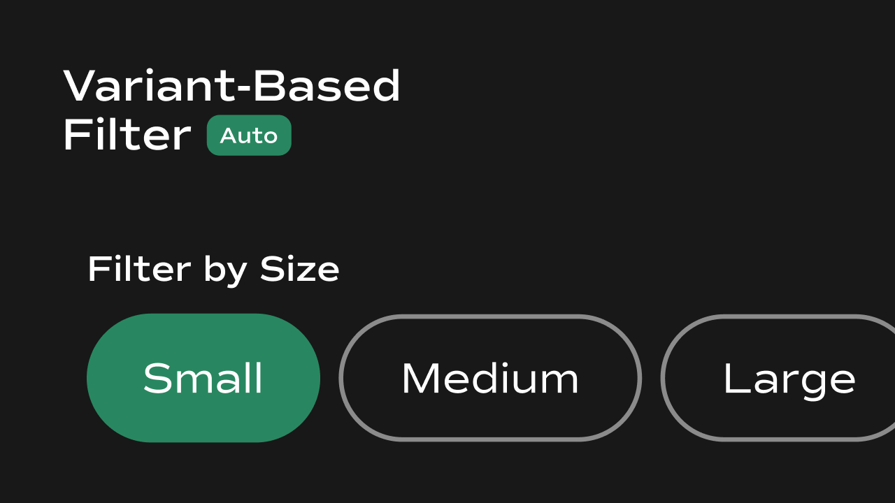
- Groups by option name — variant options are automatically grouped and labeled by their Shopify option name (e.g. all Size values together, all Color values together).
- Single or multi-select — can be configured to allow selecting one filter at a time or multiple filters simultaneously.
- AND/OR filter logic — selecting multiple values within the same option group uses OR logic (e.g. Small OR Medium). Selecting values across different option groups uses AND logic (e.g. Size: Small AND Color: Black).
- **Persists selection in **
localStorage— the active filter tags and the matching product IDs are both written tolocalStorageand kept in sync across page interactions and component instances. - Broadcasts storage events — fires
storageevents so other components (e.g. a product grid) can react to filter changes without a page reload. - Optional label — a text label can be shown above the filter buttons.
- Preview-safe — renders dummy Size and Color options in Framer’s canvas when Shopify credentials are unavailable.
Property Controls
All controls are accessible in Framer’s right panel when the component is selected. They are grouped into the following sections: Initial, Label, Show Label, Product Limit, Variants Per Product, Fetch All Variants, Enable Multi-Select, Filter by Product ID, Layout, Gap, and Styles.Initial
| Property | Type | Default | Description |
|---|---|---|---|
| Initial | String | "" | The default filter value pre-selected when the component first loads. Leave empty to show all products by default. |
Label
| Property | Type | Default | Description |
|---|---|---|---|
| Label | String | Filter by Variant | The text shown above the filter buttons when Show Label is enabled. |
Show Label
| Property | Type | Default | Description |
|---|---|---|---|
| Show Label | Boolean | true | Toggle the label above the filter buttons on or off. |
Product Limit
| Property | Type | Default | Description |
|---|---|---|---|
| Product Limit | Number | 50 | How many products to fetch per page from Shopify. Only applies when Fetch All Variants is disabled. Range: 1–250. |
Variants Per Product
| Property | Type | Default | Description |
|---|---|---|---|
| Variants Per Product | Number | 250 | Maximum number of variants fetched per product. Shopify’s hard limit is 250. |
Fetch All Variants
| Property | Type | Default | Description |
|---|---|---|---|
| Fetch All Variants | Boolean | false | When enabled, the component paginates through all products in your Shopify store (up to 100 pages). When disabled, only the first batch of products (up to Product Limit) is fetched. Enable this for large catalogs. |
Enable Multi-Select
| Property | Type | Default | Description |
|---|---|---|---|
| Enable Multi-Select | Boolean | true | When enabled, users can select multiple filter values at once. When disabled, selecting a new value deselects the previous one. Clicking the active value always clears it. |
Filter by Product ID
| Property | Type | Default | Description |
|---|---|---|---|
| Filter by Product ID | String | "" | Optional. Enter a Shopify product ID to limit the variant options to a single product only. Leave empty to show options from all products. |
Layout
| Property | Type | Default | Description |
|---|---|---|---|
| Layout | Enum | Row | Arrange filter buttons horizontally (Row) or vertically (Column). Buttons also wrap to a new line when they overflow the available width in Row mode. |
Gap
| Property | Type | Default | Description |
|---|---|---|---|
| Gap | Number | 8 | Spacing between filter buttons. |
Styles
Controls the visual appearance of the filter buttons.| Property | Type | Default | Description |
|---|---|---|---|
| Font | Font | — | Typography for all filter buttons. |
| Selected Color | Color | #fff | Text color of an active (selected) filter button. |
| Unselected Text Color | Color | #333 | Text color of inactive filter buttons. |
| Selected Background Color | Color | #1976d2 | Background color of an active filter button. |
| Unselected Background Color | Color | #fff | Background color of inactive filter buttons. |
| Disabled Text Color | Color | — | Text color for any disabled state. |
| Border Radius | Number | 8 | Rounds the corners of filter buttons. |
| Box Shadow | String | none | CSS box shadow applied to filter buttons (e.g. 0 2px 4px rgba(0,0,0,0.1)). |
| Border | Object | 1px solid rgba(0,0,0,0.12) | Border applied to filter buttons. Configurable via borderWidth, borderStyle, and borderColor. |
| Padding | Number | 8 | Inner spacing inside each filter button. |
Notes
- This component requires
window.DOMAINandwindow.ACCESSTOKENto be set globally on the page for live Shopify data fetching. Without these, it renders dummy Size and Color options for canvas preview. - Filter state is stored in
localStorageunder two keys:variantFilter(selected tags) andvariantFilterProductIds(matching product IDs). Any other component on the page can read these keys to apply the filter. - The component fires a
storageevent onwindoweach time the filter changes, so product listing components can reactively update without a page reload. - AND/OR logic: multiple values within the same option (e.g. two sizes) are combined with OR. Values across different options (e.g. a size and a color) are combined with AND.
- In Fetch All Variants mode, the component paginates through up to 100 pages of products. For very large catalogs this may take a moment on first load.