Price Sort Controller
A price sorting dropdown component for Framer that stores the active sort order insessionStorage and broadcasts a storage event for a product listing component to reactively re-sort its results.
What It Does
The Price Sort Controller renders a styled native dropdown (<select>) with three fixed sort options: Recommended, Price Low → High, and Price High → Low. When the user changes the selection, the component saves the value to sessionStorage and fires a storage event — allowing a product grid on the same page to reactively re-sort without a page reload.
Key behaviors at a glance:
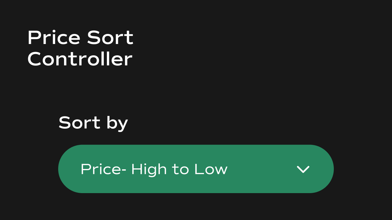
- Three sort options — Recommended (default CMS order), Price: Low → High, and Price: High → Low. These are fixed and not configurable.
- **Persists selection in **
sessionStorage— the active sort value is stored under the keypriceSortand restored on page load within the same browser session. - Broadcasts storage events — fires a
storageevent onwindowwhen the sort changes, so a product listing component can listen and re-sort reactively. - Custom chevron icon — the native dropdown arrow is hidden and replaced with a custom SVG chevron whose color and size are configurable.
- Optional label — a text label can be shown above the dropdown with full typography and color control.
Property Controls
All controls are accessible in Framer’s right panel when the component is selected. They are grouped into six sections: Initial, Label, Container, Border, Text, and Icon.Initial
| Property | Type | Default | Description |
|---|---|---|---|
| Initial | Enum | Recommended | The sort order selected by default on first load. Options: Recommended (default CMS order), Low → High, High → Low. If a value is already stored in sessionStorage, that takes precedence over this setting. |
Label
Controls the text label displayed above the dropdown.| Property | Type | Default | Description |
|---|---|---|---|
| Text | String | Sort | The label text shown above the dropdown. |
| Show | Boolean | true | Toggle the label on or off. |
| Font | Font | 16px | Typography for the label text. |
| Color | Color | #181A2C | Text color of the label. |
| Gap | Number | 4 | Spacing between the label and the dropdown. |
Container
Controls the dropdown’s outer box.| Property | Type | Default | Description |
|---|---|---|---|
| Padding | Number | 8 | Inner spacing inside the dropdown. Also controls the right-side padding used to reserve space for the chevron icon. |
| Radius | Number | 8 | Rounds the corners of the dropdown. |
| Background | Color | white | Background color of the dropdown. |
Border
Controls the border around the dropdown.| Property | Type | Default | Description |
|---|---|---|---|
| Width | Number | 1 | Border thickness in pixels. Set to 0 to remove the border. |
| Style | Enum | Solid | Border style. Options: Solid, Dashed, Dotted, None. |
| Color | Color | rgba(0,0,0,0.12) | Border color. |
Text
Controls the typography of the dropdown options.| Property | Type | Default | Description |
|---|---|---|---|
| Font | Font | System font, 14px | Typography for the text inside the dropdown options. |
| Color | Color | #000000 | Text color of the dropdown options. |
Icon
Controls the custom chevron icon on the right side of the dropdown.| Property | Type | Default | Description |
|---|---|---|---|
| Color | Color | #000000 | Fill color of the chevron icon. |
| Size | Number | 20 | Width and height of the chevron icon in pixels. Range: 12–32. |
Notes
- The sort value is stored in
sessionStorageunder the keypriceSort. It persists for the duration of the browser session but is cleared when the tab is closed. - The component fires a
storageevent onwindowwhen the sort changes. A product listing component should listen for this event and readsessionStorage.getItem("priceSort")to apply the new order. - The three sort options (Recommended, Low → High, High → Low) are hardcoded and cannot be changed from the Framer panel.