 A Shopify-connected variant selector component for Framer that renders clickable option buttons (size, color, frame style, etc.) with real-time availability checking.
What It Does
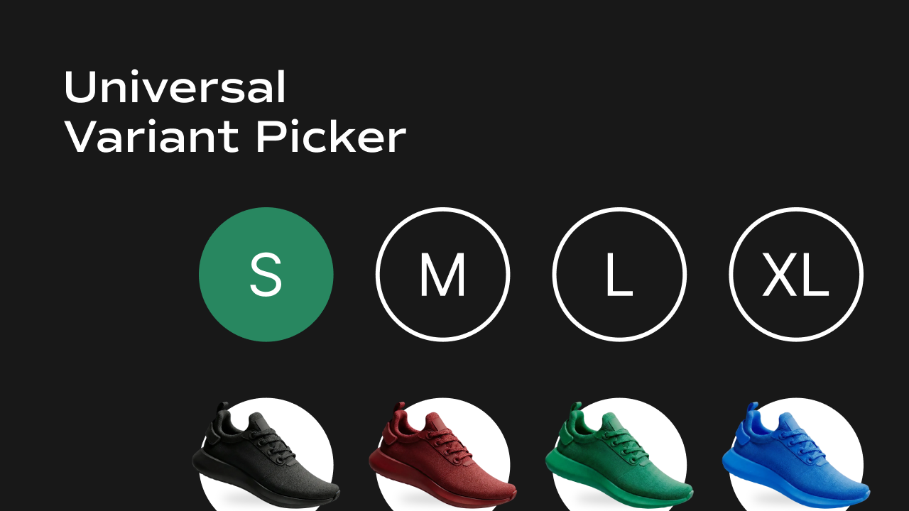
The Universal Variant Picker displays the selectable options for a Shopify product — such as Size, Color, or Frame Style — as a row or column of buttons. It is designed to be placed once per option type, so a product with both Size and Color options would use two separate instances of this component. Key behaviors at a glance:- Renders one option group — each instance handles a single option type (e.g. one picker for Size, another for Color). The option name is set via the Variant Name control.
- Live availability from Shopify — on load, the component queries the Shopify Storefront API to fetch fresh
availableForSalestatus for every variant, overriding stale CMS data. - Smart selection logic — when a user selects a value (e.g. “XL”), the component finds the variant that matches both the new value AND all other currently selected options (e.g. the current Color), keeping selections consistent across pickers.
- Unavailable options — variants that are out of stock are shown at reduced opacity with a diagonal strikethrough line and cannot be clicked.
- URL-driven state — the active variant is stored in the
?variant=URL query parameter. All pickers on the page read and write to this same parameter, so they stay in sync with each other and with the gallery components. - Auto-selects first available — if no valid variant is in the URL, the component automatically selects and sets the first available variant.
- Optional label — a text label (e.g. “Size”) can be shown above or beside the options, with full typography and color control.
Property Controls
All controls are accessible in Framer’s right panel when the component is selected. They are grouped into four sections: Variants, Variant Name, Label, and Options.Variants (CMS)
| Property | Type | Description |
|---|---|---|
| Variants | String (JSON) | A JSON array of all product variant objects from Shopify, each containing id, title, price, availableForSale, image, and selectedOptions. Connect this to the Variants variable from your Framer CMS. |
Variant Name
| Property | Type | Default | Description |
|---|---|---|---|
| Variant Name | String | Size | The exact name of the Shopify option this picker controls. Must match the option name in Shopify exactly (e.g. Color, Size, Frame Style). Case-sensitive. |
Label
Controls the label displayed alongside the option buttons.| Property | Type | Default | Description |
|---|---|---|---|
| Show | Enum | Show | Toggle the label on or off. Options: Show, Hide. |
| Font | Font | — | Typography settings for the label text (family, size, weight, etc.). |
| Color | Color | — | Text color for the label. |
| Direction | Enum | Column | Layout direction of the label relative to the options. Row places the label beside the options; Column places it above. |
| Gap | Gap | 8px | Spacing between the label and the options group. |
| Alignment | Enum | Center | Vertical alignment of the label and options when in Row direction. Options: Center, Flex Start, Flex End. |
Options
Controls the appearance and layout of the individual option buttons.Layout
| Property | Type | Default | Description |
|---|---|---|---|
| Layout | Enum | Row | Arrange option buttons horizontally (Row) or vertically (Column). |
| Gap | Gap | 8px | Spacing between individual option buttons. |
| Padding | Padding | 12px | Inner spacing inside each option button. |
| Border Radius | BorderRadius | 8px | Rounds the corners of each option button. |
| Border | Border | 1px solid rgba(0,0,0,0.5) | Border style applied to all option buttons. |
| Box Shadow | BoxShadow | — | Shadow applied to option buttons. |
| Font | Font | — | Typography for the text inside option buttons. |
States
Option buttons have three visual states — Selected, Unselected, and Disabled — each with independent color controls. Selected (the currently active option)| Property | Type | Default | Description |
|---|---|---|---|
| Color | Color | #fff | Text color of the selected option button. |
| Background | Color | #000 | Background color of the selected option button. |
| Property | Type | Default | Description |
|---|---|---|---|
| Color | Color | #000 | Text color of unselected option buttons. |
| Background | Color | #fff | Background color of unselected option buttons. |
| Property | Type | Default | Description |
|---|---|---|---|
| Color | Color | #999 | Text color of unavailable option buttons. These also render at 50% opacity with a diagonal strikethrough. |
Notes
- This component requires
window.DOMAINandwindow.ACCESSTOKENto be set globally on the page for live Shopify availability fetching. Without these, it falls back to the availability data from the CMS. - Place one instance of this component per option type. A product with Size and Color options needs two separate Universal Variant Picker components, each with a different Variant Name.
- The Variant Name must exactly match the option name as defined in Shopify (e.g.
Frame Style, notframe styleorFrameStyle). - All pickers and gallery components on the same page share state through the
?variant=URL parameter automatically — no additional wiring needed.